micromap and tmap
In this final module we’ll cover some useful packages for exploratory spatial data analysis, as well as general mapping. There are other packages available for R that can accomplish these tasks but we don’t have time to cover them all. We’ll focus specifically on the micromap and tmap packages because of their unique functionality relative to more generic mapping packages.
micromap
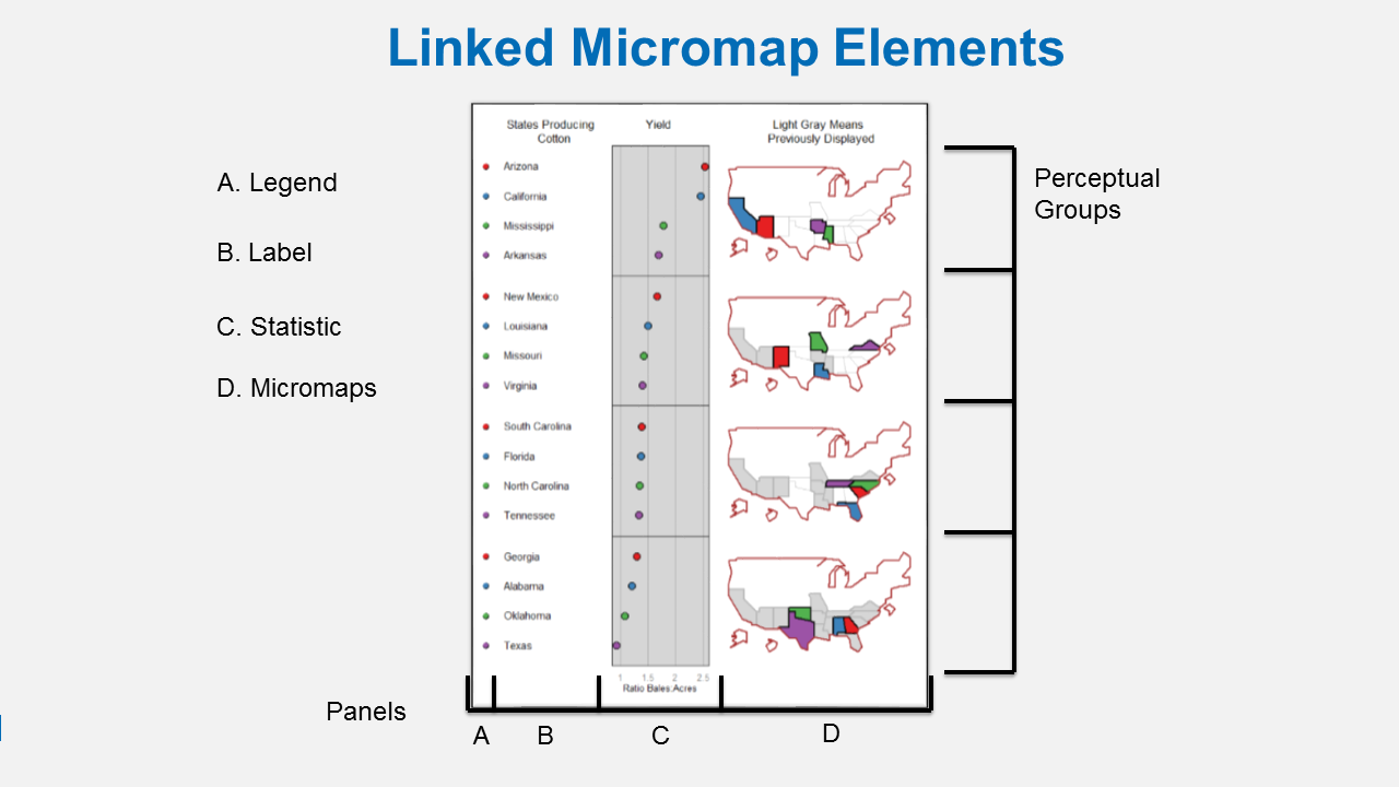
A linked micromap is a graphic that simultaneously summarizes and displays statistical and geographic distributions by a color-coded link between statistical summaries of polygons to a series of small maps. The package is described in full in an article published in the Journal of Statistical Software. This figure shows the four elements of a linked micromap.
A recent study by McManus et al. (2016) used linked micromaps to summarize water quality data collected from a spatially balanced, probabilistic stream survey of 25 watersheds done by West Virginia Department of Environmental Protection. That visualization led to a multivariate spatial analysis based on the contiguity of the watersheds, which was based on work done in R by Dray and Jombart (2011) and Dray et al. (2012).
The dataset was created by summarizing watershed land use from NLCD data and appending the information to a shapefile of waterbody IDs. We’ve included the shapefile with the workshop data, which should be in your data folder. Since micromap does not work with sf objects, we’ll import it as a SpatialPolygonsDataFrame object using the readOGR function from the rgdal package.
library(rgdal)
shp <- readOGR(dsn = './data', layer = "micromap_dat")
class(shp)
## [1] "SpatialPolygonsDataFrame"
## attr(,"package")
## [1] "sp"
head(shp@data)
##              huc12name    HUC_8     HUC_10       HUC_12 SHAPE_Leng
## 0         Poplar Creek 05090202 0509020212 050902021201  0.4195477
## 1     Cloverlick Creek 05090202 0509020212 050902021202  0.5463019
## 2       Lucy Run-EFLMR 05090202 0509020212 050902021203  0.4973302
## 3       Todd Run-EFLMR 05090202 0509020211 050902021103  0.5480372
## 4 Backbone Creek-EFLMR 05090202 0509020212 050902021204  0.4219615
## 5 Fivemile Creek-EFLMR 05090202 0509020211 050902021102  0.7076978
##    SHAPE_Area  decidmin  decidq1 decidmed  decidq3  decidmax cropmin
## 0 0.006644419 14.241294 34.76991 44.45805 55.83815  80.19169       0
## 1 0.011394350  0.000000 23.24940 31.97533 55.01489  78.54488       0
## 2 0.009360098  0.000000 37.68705 54.62358 68.85654 100.00000       0
## 3 0.005664223 10.656934 23.45861 48.14815 63.79253 100.00000       0
## 4 0.005609581  3.076923 36.94350 50.00000 60.61446  92.39130       0
## 5 0.011479134  2.340597 20.32731 32.72323 46.97142 100.00000       0
##       cropq1   cropmed    cropq3  cropmax
## 0  9.4912281 22.243602 35.559410 66.54229
## 1 13.1047342 35.458902 52.056075 76.81607
## 2  0.0000000  1.881660  9.820335 74.73684
## 3  8.9527296 26.086957 52.093989 88.38863
## 4  0.3770609  6.280992 24.462801 86.12818
## 5 29.4473001 47.104019 64.995053 92.09040
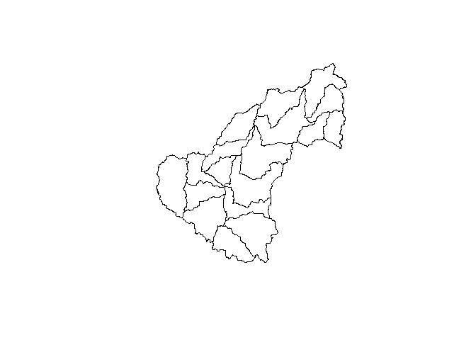
plot(shp)
The minimal requirements to create a micromap are defined using these arguments for the mmplot function:
map.dataThe input data object.panel.typesThe types of panels to include in the micromap.panel.dataThe data (columns) inmap.datato use for each panel type.
The rest of the arguments below are optional. These define which variable the plot is sorted by (ord.by), if the axes are flipped (rev.ord), how many observations are in each perceptual group (grouping), and whether or not to include a median row (median.row).
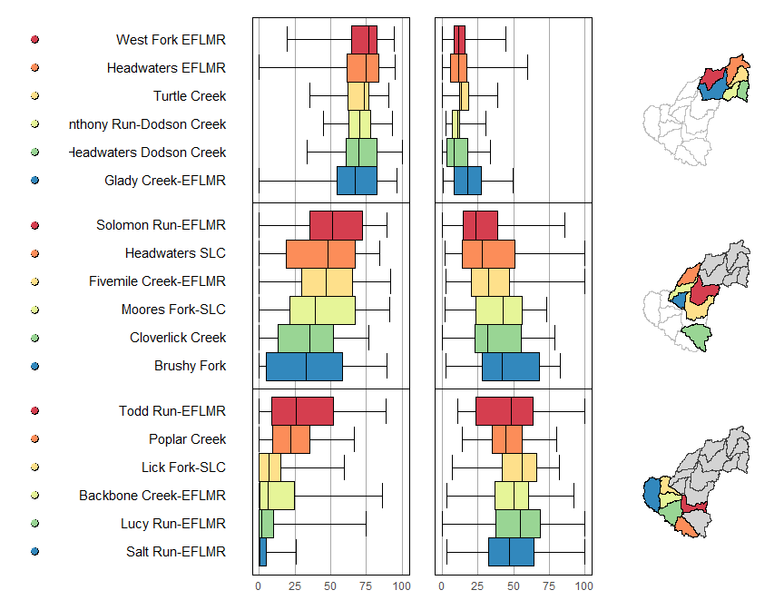
mmplot(map.data = shp,
       panel.types = c('dot_legend', 'labels', 'box_summary', 'box_summary', 'map'),
       panel.data=list(NA,
                       'huc12name',
                       list('cropmin', 'cropq1', 'cropmed', 'cropq3', 'cropmax'),
                       list('decidmin', 'decidq1', 'decidmed', 'decidq3', 'decidmax'),
                       NA),
       ord.by = 'cropmed',
       rev.ord = TRUE,
       grouping = 6,
       median.row = FALSE
       )
There are also a staggering array of options to customize the elements of the micromap. These are passed as a list of lists that correspond to the order of the panel.types. You can view the vignette for micromap to see the entire range of options (run vignette('Introduction_Guide', package = 'micromap') in the console to open the pdf).
mmplot(map.data = shp,
  panel.types = c('dot_legend', 'labels', 'box_summary', 'box_summary', 'map'),
  panel.data=list(NA,
                  'huc12name',
                  list('cropmin', 'cropq1', 'cropmed', 'cropq3', 'cropmax'),
                  list('decidmin', 'decidq1', 'decidmed', 'decidq3', 'decidmax'),
                  NA),
  ord.by = 'cropmed',
  rev.ord = TRUE,
  grouping = 6,
  median.row = FALSE,
  panel.att=list(list(1, panel.width=.8, point.type=20, point.size=2,point.border=FALSE, xaxis.title.size=1),
                 list(2, header='WBD HUC12', panel.width=1.25, align='center', text.size=1.1),
                 list(3, header='2011 NLCD\nCropland',graph.bgcolor='white',
                    xaxis.ticks=c( 0, 25, 50, 75, 100),
                    xaxis.labels=c(0, 25, 50, 75, 100),
                    xaxis.labels.size=1,
                    xaxis.title='Percent',
                    xaxis.title.size=1,
                    graph.bar.size = .6),
                 list(4, header='2011 NLCD\nDeciduous Forest',
                    graph.bgcolor='white',
                    xaxis.ticks=c( 0, 25, 50, 75, 100),
                    xaxis.labels=c(0, 25, 50, 75, 100),
                    xaxis.labels.size=1,
                    xaxis.title='Percent',
                    xaxis.title.size=1,
                    graph.bar.size = .6),
                 list(5, header='Micromaps',
                    inactive.border.color=gray(.7),
                    inactive.border.size=2)
                 )
  )
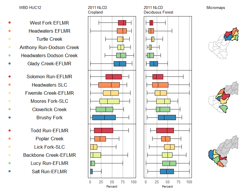
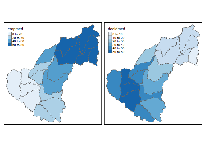
Now compare the linked micromap with two choropleth maps that represent similar information. We get the same conclusion but the micromap adds much more context and has a higher information to ink ratio.
tmap
tmap is a newish R package for creating thematic maps based on the grammar of graphics (gg) approach used with ggplot2. An article was recently published in the Journal of Statistical Software that describes the package in detail.
The chloropleth map we just saw was created with tmap:
library(tmap)
qtm(shp = shp, fill = c("cropmed", "decidmed"), fill.palette = c("Blues"), ncol = 2)
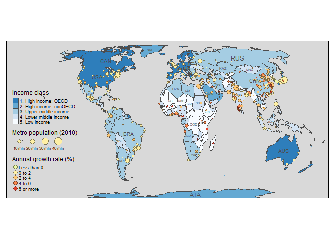
The package can do a lot of cool things but we’ll just cover a few of them here. You can have a look at the article for more details. This is the first figure from the paper:
data("World", "metro", package = "tmap")
metro$growth <- (metro$pop2020 - metro$pop2010) / (metro$pop2010 * 10) * 100

m1 <- tm_shape(World) +
  tm_polygons("income_grp", palette = "-Blues",
    title = "Income class", contrast = 0.7, border.col = "grey30", id = "name") +
  tm_text("iso_a3", size = "AREA", col = "grey30", root = 3) +
  tm_shape(metro) +
  tm_bubbles("pop2010", col = "growth", border.col = "black",
    border.alpha = 0.5,
    breaks = c(-Inf, 0, 2, 4, 6, Inf) ,
    palette = "-RdYlGn",
    title.size = "Metro population (2010)",
    title.col = "Annual growth rate (%)",
    id = "name",
    popup.vars = c("pop2010", "pop2020", "growth")) +
  tm_format_World() + tm_style_gray(frame.lwd = 2)
m1
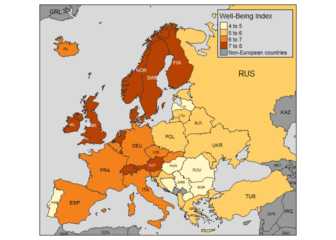
Here are some other cool plots from the vignette.
Informative chloropleth maps:
data(Europe)

qtm(Europe, fill="well_being", text="iso_a3", text.size="AREA", format="Europe", style="gray",
    text.root=5, fill.title="Well-Being Index", fill.textNA="Non-European countries")
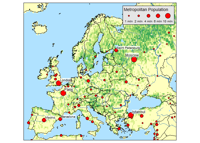
Raster and bubble plots:
data(land, rivers, metro)

tm_shape(land) +
    tm_raster("trees", breaks=seq(0, 100, by=20), legend.show = FALSE) +
tm_shape(Europe, is.master = TRUE) +
    tm_borders() +
tm_shape(rivers) +
    tm_lines(lwd="strokelwd", scale=5, legend.lwd.show = FALSE) +
tm_shape(metro) +
    tm_bubbles("pop2010", "red", border.col = "black", border.lwd=1,
        size.lim = c(0, 11e6), sizes.legend = c(1e6, 2e6, 4e6, 6e6, 10e6),
        title.size="Metropolitan Population") +
    tm_text("name", size="pop2010", scale=1, root=4, size.lowerbound = .6,
        bg.color="white", bg.alpha = .75,
        auto.placement = 1, legend.size.show = FALSE) +
tm_format_Europe() +
tm_style_natural()
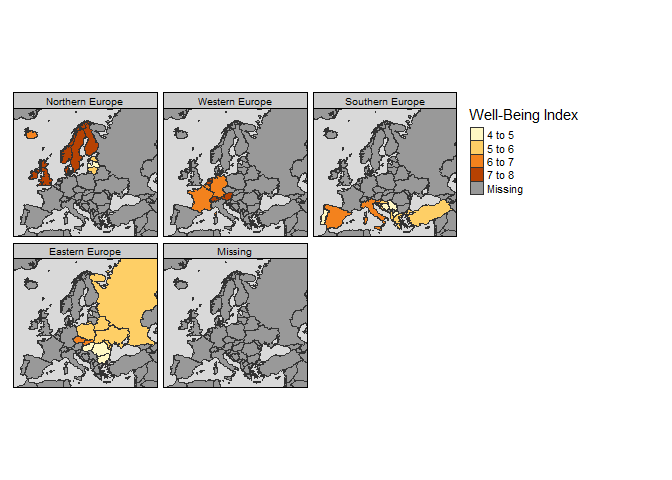
Facets:
tm_shape(Europe) +
    tm_polygons("well_being", title="Well-Being Index") +
    tm_facets("part", free.coords=FALSE) +
tm_style_grey()
Exercise
This is our last exercise of the workshop. We’ll make a quick chloropleth map of state area using the qtm function from tmap. We’ll map color to area of the states and add the state names as text.
-
Make a new code chunk in your R Markdown file and load the
sf,maps, andtmappackages. -
Create an
sfobject of states from themapspackage:states <- st_as_sf(map('state', plot = F, fill = T)) -
Use the
st_areafunction to estimate the area of each state. Make this a numeric object (as.numeric), convert it to square kilometers (divide by1e6), and bind it to the states object you just created (states$area <- area). -
Use the
qtmfunction from tmap to plot thestatesobject. Use the argumentsfill = "area",text = "ID",fill.title = "State area (km2)", andtext.size = "area". -
We can place the legend outside of the plot by using
tm_layout(legend.outside = T). Just add this code to the plot using the+sign as you would for ggplot.